Showing posts with label Photoshop. Show all posts

Saturday, January 5, 2013

When a die hard Photoshop user tries new things: Part 3 - Sumo Paint

Today after much aggravation from Shockwave Flash issues I was determined to finish what I started in Sumopaint. I had a good start in it yesterday when the Flash plugin quit on me. This has happened several times but interesting enough, only in the Sumopaint editor. No other editor that I was in killed my Flash. But then, it seems as though none of the other editors are as powerful or come anywhere close to matching up with Adobe Photoshop as Sumopaint did. (Note, its still NOT Photoshop!)

As an added test, I opened it up in Firefox and was able to continue my editing without any crashes or hiccups. It seems to save and respond to edits a lot quicker in Firefox than in Chrome - at least on a Mac. I'm not sure why I didn't think of this earlier. It probably would have saved me a lot of aggravation and Shockwave Flash crashes to my browser. (It crashed 6 times on me in Chrome and I still was not able to save the final version as a .jpg to my computer from Chrome. Thankfully, my trusty Firefox came through.)

I've been introduced to Sumopaint before at other workshops in school, so I've had the delight of playing with it before but its been a while since I've used it. It wasn't even one of my first picks, but I've read some really good reviews about this editor that I decided I should at least give it a shot. I know now, though, the next time I use it, to open it in Firefox and not Chrome.

Upon opening Sumopaint from the app, the interface and workspace area has a layout similar to Adobe Photoshop, toolbar with icons down the left side; color, swatches, and layers palettes down the right side, (That's right, I said layers!) and workspace in the middle. Just like in Photoshop, you can open an image to edit or you can create a new one. There is also a top menu much like the one in Photoshop, with File, Edit, Image, Select, Layer, Adjustments, Filters, View, and Help. (The Help menu is actually quite helpful with links to video tutorials in YouTube, information about the graphic editor, and a link to the Sumo Community which is like a forum with a gallery for "Sumopaint artists" to showcase their work. I even noticed a list of different themed contests in the Sumo Community board.

The icons in the toolbar on the left are much like the ones in Photoshop, or even Paint Shop Pro, for that matter, but are all laid out, nothing hidden under the icons that you have to go search for, like in PS. That being said, I noticed some of my favorite tools were missing, like the healing tool, dodge and burn, and the pen tool for drawing your own paths. There also does not appear to be a Red Eye Removal tool that many of the other free photo editors I used did have. (Fortunately, I did not need to fix red eyes in this photo. But I'm sure with all of the tools that were available to me, I would have been able to fix the red eyes by other means in Sumopaint should I have needed to.) Most of the tools had options and modes at the top for further fine tuning like in Photoshop. Also, some of the same keyboard short cuts I use in Photoshop worked in Sumopaint, such as using the alt key to select an area to clone from or for the color dropper selector tool while using the paint brush, and the cmd + i or d for invert or deselect on the selection tool. The one tool that did not have any available options on, which surprised me, was the cropping tool. Not even a "Constrain Proportions" check box. I would have thought with all of the flexibility and tools available in this editor that the cropping tool would have had standard image sizes or an option to constrain proportions. One thing that surprised me in a good way was the selection of brushes available. Much more than the usual round and round blurred brushes. (Incidentally, be prepared to switch tools when you first open up Sumopaint as the default opening tool is a 30 pixel dry brush set on black at 100% opacity.)

The clone tool brush took a little getting used to, but after redoing my edits on the image six times after its continuous crashes, I got a pretty good feel for using the tool. (I still like the clone brush in Photoshop MUCH better, but its good to know this editor has a clone tool.) The selection tools give you the type options of rectangle, round/elliptical, lasso (and polygon lasso), and magic wand with options for straight selection, added selection and subtract from selection modes. You also have the ability to change the border color (or even hide the border) and smooth the border. Right clicking the mouse or going up to the Selection Menu presented options to Expand, Contract, Feather, change the Border size, Inverse, and Deselect. Although plentiful in choices, Sumopaint's selection tools and advanced modes lack the Smart Radius and Edge Refinement capability found in Adobe Photoshop CS5 (and now CS6), as well as PS's Content Aware fill. However, in a lot of ways, Sumopaint reminds me of the Photoshop's early days, back to version 5. (I still remember my excitement to see how much the selection technology had advanced when version 7 came out.)

Sumopaint does have a limited assortment of filters like Photoshop's prepackage filters, but the free version of Sumopaint is limited even further with teasers left in the menu only to show you that its available in the pro version. (But at $19 for the Pro Plus version which allows you to install the editor on your own computer, its only a small teaser.)

I love the layers palette. Anyone who knows me knows I work in layers, lots of layers. (Always have multiple browser windows open with multiple upon multiple application windows open and running in the background, all the time. And the layers of paper stacks on my desk... well, that's another blog article!) I did not notice a mask layer ability, but there are layer blending options (I think they call them layer effects or fx, which is really what they are.) such as drop shadow, inner shadow, bevels, gradients, stroke, and overlay. And Sumopaint does have  the ability to Save in Layers, which is a BIG plus in my craft book! (.sumo extension which opens only in Sumopaint and does NOT save your layer style settings, like multiply, darken, lighten, overlay, screen, hard light, linear dodge, and invert. This I discovered in one of my many redos while opening the .sumo file.)

Although I did not use it in my image editing with this photo, I did take a look a the Text Tool and perused through the different fonts. I was pleasantly surprised to see that although it was a web based editor, it used the fonts I had installed in my computer in the font list. I was also pleased to see that there was the ability to rasterize and transform the text. (Although, it lacks Photoshop's robust vector processor as the  transformed text becomes pixelated and blurry very quickly. Yes, I took the liberty to play around with the Text Tool to see what it was capable of. :)

Other noticeable features missing included an HDR (High Dynamic Range) preset or filter, Photo Filter under Adjustments, Highlight/Shadows or Details adjustment options, and the ability to adjust the dpi (Dots Per Inch), or change from pixels to inches. I like being able to set photos I know I will be printing to 300 dpi and adjusting the image print out size in inches. One thing I did notice was that my resized image was automatically compressed to 72 dpi from the 300 dpi image that was uploaded. I wonder if the pro plus version when installed on the computer would allow you to adjust these settings.

All in all, not a bad little editor for a free version. It's quite powerful in its own right, as far as the free and inexpensive editors go. (Take a gander through the little intro videos on the Sumopaint home page to see some of its capabilities. Its quite inspiring, really.) However, like Photoshop, I do not recommend this editor for beginners. Its many, many options and tools (with icon images rather than text) can make it confusing for newbies. Below is the (reduced) image I edited in Sumopaint. (In Firefox. )
Pros:
An actual color palette with the ability to draw/select colors right from my photo, ability to create your own image from scratch, LOTS of drawing and shape tools, the layers palette and the ability to save in layers, a wide range of selection types and modes for fine tuning your selection (like selecting hair), blending options and layer effects, uses installed fonts from own computer in the Text Tool, nice assortment of preset gradients with the ability to adjust them and create new ones as needed, inexpensive pricing on pro versions ($9 for the Pro with extended tool and filter palettes, and $19 for the Pro Plus version with a desktop application and the ability to work offline)

Cons:
Can be confusing and difficult for beginners and newbies to photo editing, heavy Flash based interface does not like to cooperate with Google Chrome on Mac, missing the healing tool, pen/paths tool, dodge and burn tools, and content aware fill, cropping tool does not have any adjustment options or constrain proportions, does not have the ability to change the dpi or print measurement settings (inches or cm)


When a die hard Photoshop user tries new things: Part 2 - BeFunky

Opening up Google Chrome and clicking on one of the free image editors I added to my browser, I first went to BeFunky. Now, it says it adds the app to the browser, but what it really appears to do is simply add the icon as a bookmark to the site. I should also mention that I did not register to use any of these editors, although you could register. I believe that by registering and logging into your account, it will store a copy of the image you worked on in your account, and also places a copy in their gallery. I don't need any extra spam and chose not to register. When you first go to BeFunky Photo Editor you are given the option to get the app from Google Play, Get Started, view their gallery, or login - I opted for the nice big green "Get Started" button. From there you can upload an image from your computer, get one from an account online (like Facebook, Picasa, Flickr, Photobucket, your BeFunky account, or webcam), or select one of theirs to play around with.

The image opens in their editor and you are presented with a whole slew of editing tools on the left side menu. I was impressed by all of the options for a free editor. The tools included the standard straighten, crop, and resize, along with brightness/contrast, color controls, hue/saturation, exposure, sharpen, and even temperature control (something you don't always see in photo editors). These tools are also all spelled out for you - no guessing at what the little icons mean. Each tool has slider controls that allow you to fine tune the amount while you preview the image. You must also select the "apply" button for each edit option to take effect. There is no apparent selection tool or magic wand, however, most of the edit tools give you the option of a paint mode that will allow you to paint in the effect (by checking the reverse box) where you want it. You can also select the size of the brush in these options.

One nice feature of this editor that is like a feature in Photoshop (that I cannot live without) is that the undo button (at the bottom of your work space) stores each of the applied edits like a history palette. It gives you a mini thumbnail of each of the edits with the name of the applied edit underneath, so you can literally see each of the edits as they were applied, and go back to a particular one if need be. One of my favorite tools in Photoshop is the healing brush. (I don't know how I managed without it in the earlier versions of Photoshop.) BeFunky does not have a healing brush, but it does have a "Wrinkle Remover" that works similar to the healing brush. (Although I'm sure it is missing Adobe's more advanced "Content Aware" processor.) BeFunky also appears to not have a basic paint brush or pencil on its own, nor a color palette or dropper to select colors from the image. The exception to this is in the Eye Color, Lipstick, and Blush tools. These have a simple color palette and selector that allows you to have some control of the color in the color bar, but lacks a dropper tool to draw a color directly from the image itself. I do have to admit that using the paint brush and its intensity sliders takes some trial and error to get used to. I also think the Clone tool takes a little bit of getting used to and is not able to match the surroundings as closely as Photoshop would be able to. The Matte and Vignette tools are nice options, and something I wish Photoshop had without having to go through all the layer masking and object selection steps.

Blur Filter with Paint Mode and sliders
Blur Filter with Paint Mode
(& Reverse) selected showing
brush size at 25 px.
Photo editing history thumbnails
Image edit history showing when the "undo" button is clicked.


The Effects palette had options for 26 different featured photo effects (or filters) with multiple options in each effect (also with sliders for more fine tuned control) much like the effects in OnOne Software's Photo Tools Pro, one of the plugins I use with Photoshop. If you upgrade to one of the paid versions of BeFunky Photo Editor, you also have nearly 80 additional photo effects available to you. Included in the featured (and advanced/upgraded) effects are Black & White, Charcoal, Cooler, Cross Process, Cyanotype, Grunge, HDR, Motion Color, Old Photo, Orton Style, Patriotic, Pinhole, Pop Art, Sepia, Sunburst, Warmer, and Vintage Colors (with more options).

The Artsy Palette includes many of the filters that Photoshop users are accustomed to under their Artistic Filters palette, such as Cartoonizer, Gouache, Impressionist, Inkify, Oil Painting, Pointillism, Sketcher, Under Painting, and Water Color, with several versions of each filter under the selections. Again, many, many additional Artsy filters are available with the upgrade/paid version of the editor. I didn't play around with much under this palette, although the Cartoonizer is kinda cool.

The Frames Palette had many options to choose from that were featured and many more that were included in the upgrade/paid version. Each one would allow a sampling of that type of frame though that you could use with the free version. I included a screen shot of the menu on the right so you could see the available options. I played around with these options but in the end opted not to use any for the particular image I was editing. The Instant (like a Polaroid photo) and the Filmstrip options I think were the coolest.

I looked around in the Text and the Goodies palettes but did not use any of these for this photo. The text is pretty self explanatory, allows you to add text to your image as an overlay. And the Goodies palette were shapes, bubbles, and themed stickers you could add to your photo.

I was able to save my edited photo directly to my computer from BeFunky, although you are also given the option to share the image in BeFunky, Tumblr, Facebook, Twitter, and Flickr as well. It says to Save to your Desktop, but I was able to navigate to the folder I uploaded the image from and save it there. Saving options are in .jpg and .png formats with a 1-10 image quality scale. I saved my reduced size image at 8 on the quality scale. This is how it turned out:
I opened all of the images back up in Photoshop so I could compare them all side by side and see the image information. The image was reduced to 72 dpi (I think when I uploaded it) from the 300 dpi image I started with. BeFunky appears to be the only one of the 4 photo editors I tried that reduced the image to 72 dpi. The others all kept my image at 300 dpi. Unlike Photoshop, there did not appear to be any way to change the dpi settings of the image. But it did allow you to enter in your own pixel or percentage sizes for the resize. You could also select one of the standard sizes like 4x6, 5x7, 8x10, and select cell phone wallpaper sizes.

I cannot even begin to say whether I think this photo editor is easy to use or not, but I do think having the words spelled out in the menu options rather than the icons made it easier than most. All in all its not a bad editor for a free photo editor.

Pros:
Easy to navigate tool palette menus, history stored in the undo button, sliders in tool palettes for fine tuning along with paint brush options, LOTS of editing tools available for free along with a nice selection of effects. frames and goodies.

Cons:
Does not allow option to change dpi (dots per inch) settings, no color selector or dropper to select colors directly from the image (or match to the image), no healing tool, clone brush is tricky to use and does not match closely enough to area selected to clone, no selector, magic lasso, smudge, dodge, or burn tools, does not do layers.

Friday, January 4, 2013

When a die-hard Photoshop user tries new things

I'll admit it - I'm a creature of habit. Serious habits! And am resistant to change. Extremely resistant. (I'm still having issues with Blog Spot going to Blogger, and let's not even discuss Blogger's "new" interface. I say new because I fought it for so long and kept changing it back to the old layout.) I'm a creature of old, going with what I know. Some may say I play it safe. (I actually had a college English teacher tell me one time that I write well but am afraid to take risks and stay true to what I know. This was said after pointing out that I could easily identify with all of my fictional characters and settings.) So, yes, I hate changes (with a passion).

Recently I've made a few changes in my life, like getting married (after 8 years of saying I'm never getting married again), changed my Win XP machine into a Hackintosh, cleaned off my desk, and slowly but surely am making the change from Safari (and Firefox) to Google Chrome. (Still working on that one.) And after nearly 20 years of being a die-hard Adobe Photoshop user (since version 5.05), I thought I would give a few online photo editors a try. Now, I've tried other photo editors in the past, like Corel's Paint Shop Pro Photo line, Phase One's Capture One for RAW editing, Apple's iPhoto, and GIMP, (My children, all fans of Ubuntu, absolutely love GIMP!) however, I always end up going back to Photoshop (in spite of the cost). I love Photoshop's tools, its flexibility, and the control it allows me over all aspects of editing. Photoshop is my number one graphic editor, web or print. I simply cannot live without it.

While opening up Chrome, you get something that looks kinda like the screen on my Android phone, or in my iPad with all of the apps icons. So, I click on the Chrome Web Store icon and what should I see before me but a few photo editors like PicMonkey, and I'm thinking, okay, in the spirit of the new year maybe I'll try a few of these. So, in the next few blog articles, I will be comparing and reviewing the features of a few of the browser based "free" photo editors. I've chosen the same image for use in all of the photo editors for comparison, one of my wedding photos. Each one began with the same unedited photo uploaded into the browser from my computer. The one below (left) is one I edited in Adobe Photoshop CS5. Each were then resized and reduced to 450 px by 299 (or 300) px for use on the web. The one on the right is the untouched image.


Friday, July 13, 2012

Learning New Things in Familiar Applications


One of my favorite applications to use on the computer is Adobe Photoshop. In fact, its one of my favorite things to do, period. I love to fire up my computer and open up Photoshop for any reason, some times, just to take my mind off my troubles. (And with the new upgrades in my computer's hardware it it opens up faster than ever! No more waiting on fonts, filters, and plugins to load!) I've been a Photoshop enthusiast for the better part of 15 years, since Photoshop 5 and now I'm on Photoshop CS5. This is my primary design and graphics editor. Sure there are others I could use and have used, like Illustrator, Fireworks, and Flash (not to mention Corel Draw), but I feel so much at home on Photoshop, why go somewhere else?

However, after 15 years of using this program, there are still so many things for me to learn about it. In my last blog article I talked about the need to learn more about using paths and the pen tool. Always committed to life-long learning, I look for ways to learn more in any area that interests me. And, even after 15 years, Photoshop is no different. One of the best ways for me to learn about something on the computer, other than the obvious, dive right in and see what it can do, is through tutorials. Some times I search for specific tutorials and other times, especially in Photoshop, I rely on sight and go by a picture that looks cool to me. There are many free tutorial sites out there on Photoshop (Planet Photoshop, Photoshop Cafe, and Adobe Tutorialz to name a few.) with great mini-lessons that teach you about the tools while you create a work of art. I love these tutorials as compared to other lessons where you sit down open it up or play the video, and they start out by, today we are going to learn how to use the pen tool... (Snooze! Sorry, already lost me!) Show me some eye-candy first (follow these steps and you can make something that looks like this) and I go, oooh!

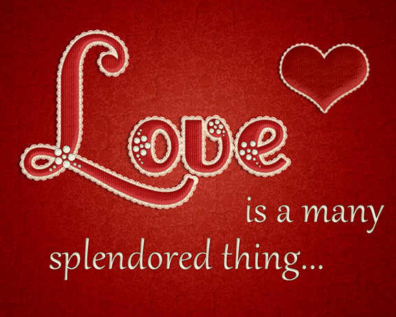
I came across a tutorial that helped me create the image at the top of the blog article while pinning around in Pinterest the other day. I almost passed it up but then noticed that it was a tutorial on creating a lace stroke effect on text. (I'm sorry I can't remember where/who I originally got it from on Pinterest.) The pin lead me to a site (Web Design Library) I wouldn't have thought of for a Photoshop tutorial (although, I now know to go there as they have MANY Photoshop tutorials and lots of other great tutorials!) I love tutorials like this one because they show you step by step with pictures of the interface you are using and what to click on and where. The screen captures allow you to work at your own pace without having to keep pausing a video at each step and then replay it. (Although video tutorials work well at times, too.)

The original image in the tutorial looked like this:


Through the course of the tutorial I learned about using the Polygon Tool (and adjusting options on it), defining a pattern, using Paths (which is what I was looking for), working with text, and much more. If you have never tried an online tutorial, I encourage you to try it - start simple, find an image you like, and start there. You will feel very good about yourself when you finish the tutorial and will have something really cool you can show. I altered mine slightly to fit in with my Moulin Rouge style kitchen (a project that I will hopefully get to this fall when the weather is cooler and more accommodating for painting cabinetry). If you would like to see the tutorial for the the Lace Stroke Text Effect shown in the picture above, click on the picture to go to the page.

Wednesday, July 11, 2012

Creating shape frames in Photoshop CS5

I'm always learning and on the look out for new things to learn. Today was no different. While working on a new layout for my school's website, I decided there had to be an easier way to make shaped outlines than the way I was doing it. Make a shape, adding a border and then deleting the shape just wasn't doing it for me. There had a be another way. So, I set out in a Google search for a tutorial. But could not find one that told me what I needed to know. Then, I started playing around with paths and discovered a way to get the outline I wanted at the thickness I needed.

I've used Photoshop for the better part of 15 years, but have never played much with the pen tool or paths. I've mostly used it as a graphic and photo editor rather than a drawing tool. (I know, some will tell me I should have used Illustrator or Corel Draw, but old habits die hard - I'm quite comfortable designing in Photoshop.) If you are like me and fairly inexperienced with using paths in Photoshop, this is for you:

Open a new document in Photoshop and add a new layer. (Or just add a new layer to what you are working on where you need the shape outline.) Select the Brush tool, making sure it is on the Hard Round setting rather than the Soft Round setting (otherwise you end up with blurred outlines), and set the Size to the size of thickness you want your outline to be. I set mine to 10 pixels.


Go to your color selector and select the desired color for the outline. (I chose red.)

Next go to your shape tool and select the desire shape you want your outline to be in. (For this example, I chose a heart.)


Make sure your Shape Tool is set to "Paths" rather than "Fill pixels", other wise you will end up with a solid shape.


And draw your shape:


Next, go to your Path palette and select your work path.


Right click (or control + click, on a Mac) so you have your Work Path edit menu, and select "Stroke Path"


You should have a color outline of your shape with a path sitting on top. It looks like a thin gray line.


You can get rid of your path now and style the outline as you like, by clicking back on the Path Palette, right clicking on the Work Path, and selecting "Delete Path":


Apply your desired Style from the Style Palette and create your own using the Blending Options in the Layer Palette. I made mine glassy looking with a rounded Bevel. This is the setting I used:


And ended up with a heart frame that looks like this:


Now you have an outline you can use to frame what ever you want inside. Its great for outlining headers, framing menu boxes, or adding an little extra to your photos. Whatever you do, just have fun with it!