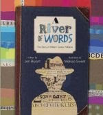
 While browsing through the children's book section of Border's books this weekend trying to decide how to spend my remaining gift cards before it was too late, I came across a book that was both intriguing and inspiring all in one. I was at first drawn to Melissa Sweets' illustrations resembling carefully constructed collages of various type styles cut from old newspapers, colored-pencil drawings, patterned wallpaper pieces, and leather bound journal pages. However, as I began to glance through the pages, poems and words and rhythms rushed off the pages and filled my mind with lesson plan ideas for a poetry unit with my intermediate students. Not knowing anything about William Carlos Williams (Yes, I admit it! I have never heard of his works until now.), but seeing magic the title "A River of Words", I decided the book was a worthy investment. And now I am so glad I bought the book! For those not familiar with William Carlos Williams poetry, or Jen Bryant's work, I highly recommend the book, "A River of Words: The Story of William Carlos Williams" by Jen Bryant. His story is an inspiration and a true testament of the American spirit.
  But, I didn't write this blog today to tell you his story. I'm writing to share a technical discovery that was inspired by Jen Bryant and Melissa Sweet's book. This is something I have been wondering about the possibility of doing for some time. But finding this book and seeing Melissa Sweet's creative illustrations inspired me to actually sit down and play with Pages in iWork to see if digital scrapbooking could be done.
As a long time fan of AppleWorks, I was skeptical when Apple first introduced Pages and Keynote some years ago (nearly 6). I tried Keynote with a trial version I picked up at FETC and liked it immediately, but it took me some time to really see the potential in Pages. I really liked the ease of designing in the drawing side of AppleWorks and liked having Apple's clipart at my fingertips, a feature missing in Pages. In fact, it wasn't until I began seriously writing college papers and needing a Mac replacement for Word that I began using Pages. (I've since fallen in love with the application in spite of the obvious lack of a vector clipart catalog. What it lacks in clipart, it makes up for in style and features, such as its masking ability with images.
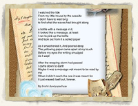
The introductory image to this blog write up shows a small sampling of a digital scrapbook page I created in Pages today borrowing a poem I found on the Internet by Brishti Bandyopadhyay. I have to admit, though, that it helps to have a tidy stash of scrapbooking backgrounds, elements (clip art), trimmings and what-nots before beginning a project such as this. Kind of like scrapbooking with a paper album - you would want to make sure you are well stocked with a wide variety of materials just for that purpose before beginning, and that all of your tools (such as scissors, glue sticks, archive safe markers and tape) are close at hand. It also helps to be familiar with your tools, or in this case, Pages inspector palettes and tool menus.
One of the attractive features about most scrapbook pages is the layers - the depths of colors and patterns. Most of the fancier ones combine several different patterned papers within the same color palette or theme, rather than pictures neatly stuck on plain white pages with black corner brackets as in the photo albums of old. So get used to working in layers, if you are not already.
To start with, decide on your background layer. What kind of pattern, print, texture, and color do you want to base your page on? While there is no particular command to insert or modify the background, your background image can be inserted as a regular image and stretched to encompass the entire size of your page and then some. Don't worry about it going off the page as it will all be "cut off" when it prints out. By this, I mean, do not worry if you have to stretch it to the point where the edge of your image goes off the visible area of your page. I started with a blank page/blank canvas in the Page Layout part of the Chooser. Then went to Insert>Choose and searched my files for the selected background image. As I said above, once the background image was inserted, I had to stretch it and pull it until the whole sheet of paper was covered.
Next, I selected a lighter, more neutral color paper background to layer on top of the background. I set it so it was smaller than the background layer so that the background layer would show around the edges of the lighter shade paper on top of it. When Pages inserts one of your images, it locks the aspect ratio and keeps the proportions when you stretch and resize it. You may need to apply a mask to this new layer so that it looks like this paper is slightly smaller proportionately to the background layer. (Format>Mask). If you click on the image, you will see handles around the corners of the image allowing you to resize of edit the image. If you click at the bottom of the image, you can resize the mask, if you like. If you hold down the Command key and mouse over the corner of the image you will notice the arrow cursor turns from straight to curved. If you click the mouse button as you are holding down the Command key and moving the corner of the image one way or the other, you will be able to rotate the image. You can do this as many times as you like adding multiple images and layering them one on top of another. If you go up to Arrange you can move the layers forwards or backwards as you like.
The Inspector palette provides some added options to customize your scrapbook page, under the Graphic Inspector (looks like a green square with a blue circle stacked on top and to the right of the square). If you select Picture Frame under the Stroke section, you can add a torn paper edge or embossed edge to your "paper layer". You can also adjust the Shadow and Opacity of the layer in the Graphic Inspector tab.
Textboxes may also be added an layered like the background images. Select the Font palette to change the font style, color, and size. You can also color the background of the textbox adding even more depth to your scrapbook page. Then head back to the Graphic Inspector tab to stylize the textbox as you would an inserted graphic.
If you have a nice collection of transparent .png clipart images, those can also be added to your scrapbook page much in the way of decorating your paper scrapbook page using stickers, decals, and appliques.
Once you are done, print it out, or save it as a .pdf which can then be brought into a graphic editor such as Adobe Photoshop. The .pdfs can be attached to email documents for convenient sending to relatives and friends, say, like as a Christmas newsletter, or to mark a special occasion you want to share/show off. What are some of your creative ideas for this application of Pages?


